Saturday, December 17, 2011

Vintage Wonderland Part III

Here's my 2011 Christmas tree, imported from South Windsor, CT. Special thanks to my Aunt Lucille for helping me choose it.


The large papier mâché angel hanging from the window molding is from Filene's Basement back when they used to have their annual Christmas in August Sale (so sad to see the Basement go this year).


This year's tree color scheme is blue and gold. The lights are all vintage C-6 sets with some bubble lights, Reliance Krystal Stars (1930s, made in Rhode Island), and plastic stars from Japan (1940s). 
There are also metal reflectors on some of the regular cone-shaped bulbs, also in blue and gold.

Most of the ornaments are vintage with some new ones mixed in. 

The real miracle is that I managed to stuff this 7-foot tree into my Honda Civic (it's not a hatchback or SUV!) and drive it from CT to Boston without completely destroying it.


The plastic angel light on top was purchased at the Brimfield Antiques Show a few years ago. 
Her halo is broken but she's otherwise in very good shape. I'm guessing she dates from the 1950s, but I'm not sure.

HAPPY HOLIDAYS TO ALL!


Vintage Wonderland Part II

Last holiday season, I started my vintage wallpaper collage series, debuting with these three pieces.


This one is entitled, "The Abominable Snow Monster on Vintage 'Cockington Farm' Wallpaper."


This one is "The Abominable Snow Monster with Ornament on Vintage 'The Woodstock' Wallpaper."


And this one is “Pixie Elves on Vintage ‘Laurentian’ Wallpaper.”

Creating these has become a fun hobby, and I'll no doubt create more in the coming year. 
Merry, Merry, Merry!

Sunday, December 4, 2011

Vintage Wonderland

This is my new vintage Christmas-motif kitchen tablecloth ...


Most often I see these with poinsettia designs or with lit candle designs. I chose this one because I love the wavy-line border and the fun geometric trees. And, the light blue, gray and black are non-traditional colors for Christmas, so all the better to coordinate with my blue, white and yellow kitchen.

Here's the tablecloth with my vintage Star Glow cream and sugar set as centerpiece:


And here's how I have the table decorated for the holidays, featuring my vintage Mt. Pleasant glass bowl filled with vintage blue Christmas ornaments. Jolly, jolly, jolly!

Sunday, November 20, 2011

November's Color Scheme: Burnished Harvest Cornucopia

Inspiration:
My vintage potato salad bowl, still beautiful and useful, chips and all.


Though the bottom of the bowl says, "Made in Japan," the painted colors make me think of the Mediterranean in summer or autumn. I pulled out the colors from this bowl to create a beautiful palette of warm hues in yellow, rust, and berry rose, which I envision working equally well in a living room, kitchen or dining room.


If I were designing a traditional living room with this palette, I'd use Mountain Peak White for the ceiling, Limon for the walls, and a combination of Rust and Yellow Highlighter for the trim, depending on what the moldings and other room features look like. If the room were lucky enough to have a fireplace, I'd use the Roseate, Italiano Rose, and True Pink for the fireplace area.


I'd use these fabrics to tie the room's color palette together:


I'd use the yellow gingham for Roman shades, the burgundy for a sofa, the variegated color fabric (which cools down the color scheme a bit) for a loveseat or chairs, the boxed velvet for a large ottoman, and the copper crushed velvet fabric for pillows.


Elements:
Benjamin Moore Paints (clockwise from top): 
Mountain Peak White, Rust, Yellow Highlighter, True Pink, Pilgrimage Foliage, Delightful Yellow, Limon, Roseate, Italiano Rose.


Fabrics (clockwise from top): 
Newfield Check by Lee Jofa® in 100% cotton. Daffodil.
Pattern 180569H Highland Court Exclusive in Viscose/Cotton/Polyester. Copper.
Boxed Velvet™ by Beacon Hill® in Rayon/Cotton/Metallic. Hazelnut.
Gymkhara Weave by Lee Jofa® in 100% cotton. Chestnut.
Mingle by LoomSource in Polyester/Rayon. Passion.


Design Pile-up

Books are awfully decorative...

It was no joke when Gloria Upson quipped, "Books are awfully decorative, don't you think?" in Auntie Mame. Despite the current prevalence of clicking or scrolling to read your favorite book, I have to agree with Gloria.

There's a lot to be said for a coffee table displaying a neatly stacked collection of books ... it just looks, well, neat.

Books are displayed this way in just about every shelter magazine spread you see, so it must be the correct way, right?

But, why not try fanning the very same collection of books?


It adds visual interest to have the books fanned, and helps you to see parts of the front covers for the whole stack. It also makes for a less uptight, more casual look. I think this technique tends to work better with magazines, but if you don't have too many books in one stack, give it a whirl.

Wednesday, November 9, 2011

Step On It, Joe!

I once had a GO AWAY doormat in my first Boston apartment, and someone stole it.

Now I have this:

Barnboard Doormat

Though it's still off-gassing, I have it in my kitchen in front of the sink. I especially like its trompe l'oeil effect. My only minor quibble aside from the off-gassing: I wish they hadn't rounded the corners so it would look even "rawer." In any case, I think it was an excellent update, and it complements the new natural shade I installed on my window this past summer.

Sunday, November 6, 2011

Torero! Vintage Wallpaper Collage


This is the largest wallpaper collage I've done so far. It measures 17" x 24", which is about the full size of the wallpaper sample. This piece is entitled, Torero! on vintage Salon de Paris wallpaper with fishnet.


First, I drew the bullfighter by copying an illustration from a vintage LP cover, Torero! Music of the Bullfight. The original definitely looks like a watercolor. I used colored pencils and Tombo markers to achieve a similar effect.


In addition to the difficulty in getting the proportions of the drawing correct, cutting and pasting the drawing onto the wallpaper was also a challenge. Originally, I was going to use blue and red party toothpicks for the arrows attached to the bull, but I managed to cut them out successfully from the drawing.

I added the fishnet last to give the piece a more gothic feeling suggested by the very dark wallpaper (Can you imagine having wallpaper this dark in your house today?!). I wasn't sure how to attach the fishnet to keep it taut. I thought thumbtacks might work but they were a bit too long and would have pushed through the foamboard. So, I used black thread to tie the fishnet in the back:


It looks very much like a mess of spiderwebs, doesn't it?

Check back here in December, when I post the Christmas wallpaper collages I completed last year.

Sunday, October 23, 2011

Vintage Wallpaper Collages


This first collage is Mr. Owl on "Fontainebleau" vintage wallpaper.


This second collage is Mr. Owl on "Virginia Colony" vintage wallpaper.

I drew Mr. Owl using colored pencils and Tombo markers.


This is the vintage wallpaper book (I'm guessing it's from the 1950s) I salvaged from the trash in my condo building years ago from which I took the wallpapers I used for the above collages. The book measures 20" x 24". A lot of the designs are dark and predominantly floral, but there are some interesting deviations of scenes and textures, some with metallic details. 


This is the inside cover of the book. Apparently there was a showroom of some sort at 405 Boylston St. in Boston at one time. Many of the samples are brittle and falling apart, and it seems a shame for this book to sit and deteriorate, so that's why I'm using the samples for collages.

I'm currently working on another vintage wallpaper collage. I've chosen the wallpaper sample but haven't tackled the drawing yet. I'll post it here when it's completed.

Last year I made a series of Christmas collages with some of the samples in this book. Revisit this blog in December at which time I'll post those.


Sunday, September 11, 2011

Gnome Man's Land

Meet Leo... 


I don't have a garden of my own, but now I do have my very own garden gnome, Leo. I thought of naming him Vinny since part of his ear is cut off, but the name just didn't suit him well. He seems too jolly.

He was a great bargain I snatched up for $20 at the most recent Brimfield Antiques Show.

He's currently residing in my computer/play room, but I will probably move him around depending on my mood. If nothing else, he'll make a great doorstop (he just gave me a dirty look — sorry, Leo). He is quite heavy.

Sunday, August 28, 2011

La Cage aux Folles Comes Home?


What economic recession?

These caged chandeliers by way of the latest Restoration Hardware sepia tome are stunningly beautiful, strongly whimsical, yet also tragic.

They're light imprisoned, cascades of captured diamonds, completely untouchable. Ultimately unknowable — unownable. Which makes me want one.

I envision these in a grand Victorian mansion, a Gothic castle, a marble bathroom or how about inside a Catholic church?!

To "free" them, I would refinish the cold metal cages in high-lacquer paint in hot pink, white, turquoise, orange or chartreuse, and hang them over a furry Flokati rug.

Sunday, August 21, 2011

August's Color Scheme: Rhinestone Glam Power Point


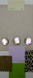
Inspiration: Fab rhinestone buttons from M&J Trimming.


These shimmery pearlescent rhinestone buttons are the punctuation to a neutral background of taupe, yellow and olive green with an animal print to give the color scheme some teeth. It's not readily apparent from the photo, but the buttons have green and purple-pink highlights from which I pulled the paint colors. What I especially like about the buttons is the way the rhinestones are embedded inside, so there's no danger in them falling off.

Elements:
Paints: Old Straw Hat, Lily Lavender, Bright Lime (all Benjamin Moore)
(I'd use Old Straw Hat for the ceiling, Lily lavender in an eggshell finish for the walls, and Bright Lime for baseboard trim, and possibly windows and doors depending on the room)

Fabrics and Wall covering:
Wall covering is Classic Washi by Pallas Walls in Linen.
Nubby green fabric is Impala by Robert Allen in Celery. Rayon/polyester/nylon.
Animal print fabric is suede (details not available).

I envision this scheme in a living room or dining room. I would use the wall covering for the top part of the walls with Lily Lavender paint for the bottom portion. I'd use a chair rail in between made of dark stained wood or brown leather fabric, and place the buttons strategically onto the chair rail. I would use the nubby green fabric for a sofa, loveseat or chairs, and the animal print for a large ottoman, X-base chair or dining chairs.

I think this look would be sophisticated and chic, especially great under the crystal glow of a grand chandelier, and reflected in the bubbly glow of Champagne glasses. Cocktails anyone?


Monday, July 4, 2011

July's Color Scheme: Breakfast Circa 1961


Imagine eating a hearty bowl of Quaker oatmeal followed by a dish of chocolate pudding topped with Cool Whip, and you have the essence of this color scheme for a breakfast room just off your kitchen or patio. It's G-r-r-r-e-a-T!

Inspiration: Vacron-Bopp Decker melamine plastic cereal bowl, early 1960s vintage, made in Birmingham, Michigan. (I've literally been eating out of this bowl since I was an impressionable Saturday morning cartoon watching kid). I recently discovered they also made these indestructible bowls in delicious yellow and pink, in addition to the aqua. They also made other pieces such as coffee mugs, a coffee pot, and a covered round casserole.

Elements:
Paints: Araucana Teal by Martha Stewart Living; Alpine White, Chocolate Mousse, and Natural Brown by Benjamin Moore.
(I'd use Alpine White for the walls, Araucana Teal for trim, and I'd paint a hardwood floor with fat stripes of Chocolate Mousse and Natural Brown).

Fabrics: Mixer BK-Patina by Robert Allen. Polyester/cotton. (I'd use this for a mid-century modern sofa or loveseat).
Dune in Birch. Linen/cotton.
(I'd use this for dining chairs or even as curtains because the fabric has a nice drape to it).

Sunday, June 19, 2011

June's Pattern Mix: Brown-out Fix


A nearby "client" asked me to freshen up his master bedroom with new window treatments and bedding. I was pleased to oblige.

Initially, I rejected any notion of using a floral ... then I saw this interesting Art Nouveau-like pattern on drapes in Urban Outfitters. The brown, pecan, ivory and white work well together, and since the room's window and door trim is chocolate brown (Ralph Lauren's Desert Boot), the pink, orange and gold in the drapes keep the room from experiencing a brown-out.

Because each pattern is a different scale — thin pinstripes, medium floral, and larger plaid — they play well together, especially against the neutral walls (Ralph Lauren's Greenhouse Blonde).

Some accessories in the room are orange and hot pink to give these neutrals some punch, and there's even a leopard print lamp shade on the nightstand lamp to give the room an added dose of "chic."

Together, these layers of pattern and color create a rich retreat that's rather sweet and luscious.

Sunday, June 5, 2011

Scrapwood wallpaper by Dutch designer Piet Hein Eek


I've long been a fan of trompe l'oeil effects, and I'm gaga (no Lady involved) over this Scrapwood wallpaper by Dutch designer, Piet Hein Eek, featured here in the May 31 Interior Design magazine.

My one concern would be that if you used it on too many walls of a room or in a large room, you might feel like "climbing the walls" after awhile. I would use this for a cozy beach cottage, perhaps in a bathroom or even on the ceiling of a bedroom. It has many possibilities, and it's just great fun!

Find Scrapwood and many more inspiring wall coverings at www.wallpapercollective.com.

Saturday, June 4, 2011

June's Color Scheme: Glamazon Power

This color scheme is inspired by Elizabeth Taylor in the 1963 film, Cleopatra, in which the star wore countless costumes. Colorwise, the most intriguing was a sunset gold gown paired with a lavender shoulder veil — not a common color combination, but one that grabs your attention. I suspect the lavender was chosen to enhance Elizabeth's eyes, which were reportedly an unusual tint of purple.


Though panned by critics at the time, I think the film has a lot of merit, particularly for its visual appeal. In addition to the gold and lavender costume (I couldn't find a representative photo), Taylor's makeup was equally stunning. I was taken by the green-grey eyeshadow outlined in kohl black.

Cleopatra makeup


I envision this color scheme used in a small to medium-sized Mediterranean family room/kitchen with walls in yellow flash, baseboards in hazel, and window trim and ceiling in lavender secret. I'd place black and white photos on portions of the wall, framed in jet black with mats in yucca plant.

Colors:
Benjamin Moore Lavender Secret and Yellow Flash
Martha Stewart Living Precious Metals Hazel

Benjamin Moore Jet Black
Martha Stewart Living Yucca Plant

Sunday, May 22, 2011

Kitchen Window Update

I just upgraded a client's kitchen window (OK —spoil alert!—I'm the client) with a new natural Roman shade.
Previously, the window was dressed with a yellow and white striped balloon valance (unfortunately, I forgot to take the "Before" picture), which had faded to dirt.
I kept the shade neutral and simple because there's a lot going on in the room, as you can see by the blue and white plate collection on the wall.
I custom ordered the shade from Home Depot with a white privacy lining and a lefthand shade pull so I won't have to reach over to the right corner to open and close the shade.
This shade will help keep the room cooler in the summer months because it gets lots of sun and additional heat from a skylight.
I also repainted the window trim in super high-gloss white.


Sunday, May 15, 2011

May's Pattern Mixes: Vertical stripes with horizontal motif & Mini-checks with tartan plaid


Left, Vertical stripes with horizontal motif: This combo works because both the shirt and tie contain white, pink and navy. The white in the shirt provides a background for the other colors, and the predominance of navy in the tie makes it pop by counteracting the verticality of the softer shirt stripes.

Right, Mini-checks with tartan plaid: This combo works because the scale of the checks is small in contrast to the large scale of the tartan. Also, both shirt and tie have lines of black and white, so they harmonize. The purple makes it pop!

Sunday, May 1, 2011

May's Color Scheme: Courtyard Desde "Frida"

"Frida" Courtyard

This color scheme is inspired by the courtyard in the Julie Taymor film, Frida, based on the life of the Mexican artist, Frida Kahlo. The story goes beyond the usual "tortured artist" clichés, and paints a well-balanced picture of a fascinating woman. If you haven't seen it, I highly recommend it — worth seeing for its visual beauty alone.

What I especially like about Latin countries — whether it's Mexico, Argentina, Spain or Portugal — is the way they embrace color with uninhibited passion. There's nothing timid or uncertain about it. This is not to say that neutrals don't sometimes come into play. For example, in this color scheme, the green/yellow hues are muted (I copied the cacti and other plant life from the film's courtyard), and complement the deep saturated blue, red, and green, creating a beautiful balance that's never dull. Viva Frida!

If I were to do a color scheme like this for an actual space (wouldn't that be something?!) I'd use a more neutral palette of fabrics like the ones I've shown here, pulled from my arsenal of fabrics from past class projects. I'd use the brown leather for a sofa, the check for curtains, and the textured reptile fabric for a bench or chairs.

Elements:
Benjamin Moore Paints:
Blue, Exotic Red, Yellow Green, Pink #1297, Citron, Summerdale Gold, Spring Dust

Fabrics:
Duralee® Pattern 13531, Polyester/Polyurethane/Cotton in Oatmeal
Lee Jofa® Newfield Check, 100% cotton in Daffodil
Townsend® Brushed Metallic Full Grain Cowhide in Remington

Monday, April 18, 2011

Sepia Tones Take Flight?

http://www.restorationhardware.com/catalog/category/index.jsp?categoryId=cat100102&link=Home#next

Would you like to live inside an antique photograph? Now you can with one of the latest design/fashion trends — sepia tones — demonstrated here in the Restoration Hardware catalog. Though the trend is a somewhat new look at neutrals, I can't help thinking of Calamity Jane and Wild Bill Hickok or one of those cheesy Western backdrop photo booths you find at malls or in Las Vegas. Granted, this is more "The Aviator" than "Viva, Las Vegas," and it does mix in elements of the current "steam punk" trend as well.

I do like the warm, timeworn look, but find it a bit too staged and precious, and made to resemble a Hollywood stage set. And, would you want this look in every room of your home? I would improve the sameness and hyper-masculinity by punching up the neutrals with dusty turquoise, pink or yellow, perhaps. Or shots of red in the textiles to give it more life. No antlers, please. Yee haw!

Sunday, April 10, 2011

April's Pattern Mix: Powder Blues with Brown

I recently purchased these new vintage 1970s pieces with the jacket and shirt in powder blue, and the tie in brown/blue/cream. I paired these with new socks in powder blue/black/cream/purple/brown. To complete the ensemble, I'd wear these pieces with medium-finish blue jeans, a black fedora and black & white saddle shoes.

Retail Therapy

Interesting trend on Newbury St. in Boston: It seems there are more British based stores now mixed in with the usual chain stores.
Ted Baker London, Hotel Chocolat, and Jack Wills, to name a few (all fabulous!)
It's also interesting that someone greeted me upon entering all three stores, and they weren't desperate to sell me something. Hotel Chocolat gave me complimentary samples (Tiddly Ducks, I think), and Jack Wills handed me their substantial catalog.

These stores also have fun and impeccably arranged displays. (Photos are of Jack Wills. Simply smashing!)

Friday, April 1, 2011

Purpose

I think Designers, whether it's graphic design, interior design or fashion design — or expressing ourselves through art — we're here to help beautify the world, even if it's in just a minor way.

Obvious Yet Profound

Inspiration often comes from something you haven't seen before or a place you've never been.

Thursday, March 31, 2011

April's Color Scheme: HOTCHA!

Inspiration: Spanish Matador in Condé Nast Traveler
This photo stimulates my heart, not to mention the rest of me. Hotcha! Delicious, delicious. Surrender.

This color scheme is bold, passionate, sexy, anti-pathetic. My Color Theory teacher often said, "If it works in nature, it will work in your home." This is often true in fashion apparel as well.
One of my Art Director co-workers says these colors remind her of a Matisse painting. Yes.
I envision this in a living room or dining room — cape is optional.

Colors:
Benjamin Moore Sunshine
Glidden Flaming Sword
Pantone 17-2627
Benjamin Moore Black