Monday, July 4, 2011
July's Color Scheme: Breakfast Circa 1961
Imagine eating a hearty bowl of Quaker oatmeal followed by a dish of chocolate pudding topped with Cool Whip, and you have the essence of this color scheme for a breakfast room just off your kitchen or patio. It's G-r-r-r-e-a-T!
Inspiration: Vacron-Bopp Decker melamine plastic cereal bowl, early 1960s vintage, made in Birmingham, Michigan. (I've literally been eating out of this bowl since I was an impressionable Saturday morning cartoon watching kid). I recently discovered they also made these indestructible bowls in delicious yellow and pink, in addition to the aqua. They also made other pieces such as coffee mugs, a coffee pot, and a covered round casserole.
Elements:
Paints: Araucana Teal by Martha Stewart Living; Alpine White, Chocolate Mousse, and Natural Brown by Benjamin Moore.
(I'd use Alpine White for the walls, Araucana Teal for trim, and I'd paint a hardwood floor with fat stripes of Chocolate Mousse and Natural Brown).
Fabrics: Mixer BK-Patina by Robert Allen. Polyester/cotton. (I'd use this for a mid-century modern sofa or loveseat).
Dune in Birch. Linen/cotton.
(I'd use this for dining chairs or even as curtains because the fabric has a nice drape to it).
Sunday, June 19, 2011
June's Pattern Mix: Brown-out Fix
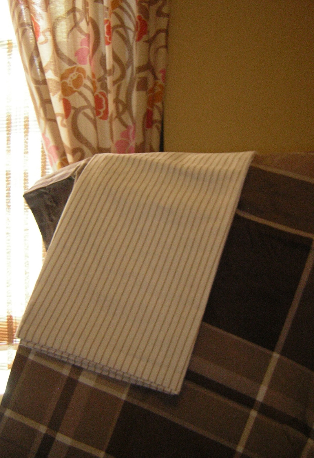
A nearby "client" asked me to freshen up his master bedroom with new window treatments and bedding. I was pleased to oblige.
Initially, I rejected any notion of using a floral ... then I saw this interesting Art Nouveau-like pattern on drapes in Urban Outfitters. The brown, pecan, ivory and white work well together, and since the room's window and door trim is chocolate brown (Ralph Lauren's Desert Boot), the pink, orange and gold in the drapes keep the room from experiencing a brown-out.
Because each pattern is a different scale — thin pinstripes, medium floral, and larger plaid — they play well together, especially against the neutral walls (Ralph Lauren's Greenhouse Blonde).
Some accessories in the room are orange and hot pink to give these neutrals some punch, and there's even a leopard print lamp shade on the nightstand lamp to give the room an added dose of "chic."
Together, these layers of pattern and color create a rich retreat that's rather sweet and luscious.
Sunday, June 5, 2011
Scrapwood wallpaper by Dutch designer Piet Hein Eek
I've long been a fan of trompe l'oeil effects, and I'm gaga (no Lady involved) over this Scrapwood wallpaper by Dutch designer, Piet Hein Eek, featured here in the May 31 Interior Design magazine.
My one concern would be that if you used it on too many walls of a room or in a large room, you might feel like "climbing the walls" after awhile. I would use this for a cozy beach cottage, perhaps in a bathroom or even on the ceiling of a bedroom. It has many possibilities, and it's just great fun!
Find Scrapwood and many more inspiring wall coverings at www.wallpapercollective.com.
Saturday, June 4, 2011
June's Color Scheme: Glamazon Power
This color scheme is inspired by Elizabeth Taylor in the 1963 film, Cleopatra, in which the star wore countless costumes. Colorwise, the most intriguing was a sunset gold gown paired with a lavender shoulder veil — not a common color combination, but one that grabs your attention. I suspect the lavender was chosen to enhance Elizabeth's eyes, which were reportedly an unusual tint of purple.
Though panned by critics at the time, I think the film has a lot of merit, particularly for its visual appeal. In addition to the gold and lavender costume (I couldn't find a representative photo), Taylor's makeup was equally stunning. I was taken by the green-grey eyeshadow outlined in kohl black.
Cleopatra makeup
I envision this color scheme used in a small to medium-sized Mediterranean family room/kitchen with walls in yellow flash, baseboards in hazel, and window trim and ceiling in lavender secret. I'd place black and white photos on portions of the wall, framed in jet black with mats in yucca plant.
Colors:
Benjamin Moore Lavender Secret and Yellow Flash
Martha Stewart Living Precious Metals Hazel
Benjamin Moore Jet Black
Martha Stewart Living Yucca Plant
Though panned by critics at the time, I think the film has a lot of merit, particularly for its visual appeal. In addition to the gold and lavender costume (I couldn't find a representative photo), Taylor's makeup was equally stunning. I was taken by the green-grey eyeshadow outlined in kohl black.
Cleopatra makeup
I envision this color scheme used in a small to medium-sized Mediterranean family room/kitchen with walls in yellow flash, baseboards in hazel, and window trim and ceiling in lavender secret. I'd place black and white photos on portions of the wall, framed in jet black with mats in yucca plant.
Colors:
Benjamin Moore Lavender Secret and Yellow Flash
Martha Stewart Living Precious Metals Hazel
Benjamin Moore Jet Black
Martha Stewart Living Yucca Plant
Sunday, May 22, 2011
Kitchen Window Update
I just upgraded a client's kitchen window (OK —spoil alert!—I'm the client) with a new natural Roman shade.
Previously, the window was dressed with a yellow and white striped balloon valance (unfortunately, I forgot to take the "Before" picture), which had faded to dirt.
I kept the shade neutral and simple because there's a lot going on in the room, as you can see by the blue and white plate collection on the wall.
I custom ordered the shade from Home Depot with a white privacy lining and a lefthand shade pull so I won't have to reach over to the right corner to open and close the shade.
This shade will help keep the room cooler in the summer months because it gets lots of sun and additional heat from a skylight.
I also repainted the window trim in super high-gloss white.
Previously, the window was dressed with a yellow and white striped balloon valance (unfortunately, I forgot to take the "Before" picture), which had faded to dirt.
I kept the shade neutral and simple because there's a lot going on in the room, as you can see by the blue and white plate collection on the wall.
I custom ordered the shade from Home Depot with a white privacy lining and a lefthand shade pull so I won't have to reach over to the right corner to open and close the shade.
This shade will help keep the room cooler in the summer months because it gets lots of sun and additional heat from a skylight.
I also repainted the window trim in super high-gloss white.
Sunday, May 15, 2011
May's Pattern Mixes: Vertical stripes with horizontal motif & Mini-checks with tartan plaid
Left, Vertical stripes with horizontal motif: This combo works because both the shirt and tie contain white, pink and navy. The white in the shirt provides a background for the other colors, and the predominance of navy in the tie makes it pop by counteracting the verticality of the softer shirt stripes.
Right, Mini-checks with tartan plaid: This combo works because the scale of the checks is small in contrast to the large scale of the tartan. Also, both shirt and tie have lines of black and white, so they harmonize. The purple makes it pop!
Sunday, May 1, 2011
May's Color Scheme: Courtyard Desde "Frida"
"Frida" Courtyard
This color scheme is inspired by the courtyard in the Julie Taymor film, Frida, based on the life of the Mexican artist, Frida Kahlo. The story goes beyond the usual "tortured artist" clichés, and paints a well-balanced picture of a fascinating woman. If you haven't seen it, I highly recommend it — worth seeing for its visual beauty alone.
What I especially like about Latin countries — whether it's Mexico, Argentina, Spain or Portugal — is the way they embrace color with uninhibited passion. There's nothing timid or uncertain about it. This is not to say that neutrals don't sometimes come into play. For example, in this color scheme, the green/yellow hues are muted (I copied the cacti and other plant life from the film's courtyard), and complement the deep saturated blue, red, and green, creating a beautiful balance that's never dull. Viva Frida!
If I were to do a color scheme like this for an actual space (wouldn't that be something?!) I'd use a more neutral palette of fabrics like the ones I've shown here, pulled from my arsenal of fabrics from past class projects. I'd use the brown leather for a sofa, the check for curtains, and the textured reptile fabric for a bench or chairs.
Elements:
Benjamin Moore Paints:
Blue, Exotic Red, Yellow Green, Pink #1297, Citron, Summerdale Gold, Spring Dust
Fabrics:
Duralee® Pattern 13531, Polyester/Polyurethane/Cotton in Oatmeal
Lee Jofa® Newfield Check, 100% cotton in Daffodil
Townsend® Brushed Metallic Full Grain Cowhide in Remington
This color scheme is inspired by the courtyard in the Julie Taymor film, Frida, based on the life of the Mexican artist, Frida Kahlo. The story goes beyond the usual "tortured artist" clichés, and paints a well-balanced picture of a fascinating woman. If you haven't seen it, I highly recommend it — worth seeing for its visual beauty alone.
What I especially like about Latin countries — whether it's Mexico, Argentina, Spain or Portugal — is the way they embrace color with uninhibited passion. There's nothing timid or uncertain about it. This is not to say that neutrals don't sometimes come into play. For example, in this color scheme, the green/yellow hues are muted (I copied the cacti and other plant life from the film's courtyard), and complement the deep saturated blue, red, and green, creating a beautiful balance that's never dull. Viva Frida!
If I were to do a color scheme like this for an actual space (wouldn't that be something?!) I'd use a more neutral palette of fabrics like the ones I've shown here, pulled from my arsenal of fabrics from past class projects. I'd use the brown leather for a sofa, the check for curtains, and the textured reptile fabric for a bench or chairs.
Elements:
Benjamin Moore Paints:
Blue, Exotic Red, Yellow Green, Pink #1297, Citron, Summerdale Gold, Spring Dust
Fabrics:
Duralee® Pattern 13531, Polyester/Polyurethane/Cotton in Oatmeal
Lee Jofa® Newfield Check, 100% cotton in Daffodil
Townsend® Brushed Metallic Full Grain Cowhide in Remington
Subscribe to:
Posts (Atom)