Sunday, August 28, 2011

La Cage aux Folles Comes Home?


What economic recession?

These caged chandeliers by way of the latest Restoration Hardware sepia tome are stunningly beautiful, strongly whimsical, yet also tragic.

They're light imprisoned, cascades of captured diamonds, completely untouchable. Ultimately unknowable — unownable. Which makes me want one.

I envision these in a grand Victorian mansion, a Gothic castle, a marble bathroom or how about inside a Catholic church?!

To "free" them, I would refinish the cold metal cages in high-lacquer paint in hot pink, white, turquoise, orange or chartreuse, and hang them over a furry Flokati rug.

Sunday, August 21, 2011

August's Color Scheme: Rhinestone Glam Power Point


Inspiration: Fab rhinestone buttons from M&J Trimming.


These shimmery pearlescent rhinestone buttons are the punctuation to a neutral background of taupe, yellow and olive green with an animal print to give the color scheme some teeth. It's not readily apparent from the photo, but the buttons have green and purple-pink highlights from which I pulled the paint colors. What I especially like about the buttons is the way the rhinestones are embedded inside, so there's no danger in them falling off.

Elements:
Paints: Old Straw Hat, Lily Lavender, Bright Lime (all Benjamin Moore)
(I'd use Old Straw Hat for the ceiling, Lily lavender in an eggshell finish for the walls, and Bright Lime for baseboard trim, and possibly windows and doors depending on the room)

Fabrics and Wall covering:
Wall covering is Classic Washi by Pallas Walls in Linen.
Nubby green fabric is Impala by Robert Allen in Celery. Rayon/polyester/nylon.
Animal print fabric is suede (details not available).

I envision this scheme in a living room or dining room. I would use the wall covering for the top part of the walls with Lily Lavender paint for the bottom portion. I'd use a chair rail in between made of dark stained wood or brown leather fabric, and place the buttons strategically onto the chair rail. I would use the nubby green fabric for a sofa, loveseat or chairs, and the animal print for a large ottoman, X-base chair or dining chairs.

I think this look would be sophisticated and chic, especially great under the crystal glow of a grand chandelier, and reflected in the bubbly glow of Champagne glasses. Cocktails anyone?


Monday, July 4, 2011

July's Color Scheme: Breakfast Circa 1961


Imagine eating a hearty bowl of Quaker oatmeal followed by a dish of chocolate pudding topped with Cool Whip, and you have the essence of this color scheme for a breakfast room just off your kitchen or patio. It's G-r-r-r-e-a-T!

Inspiration: Vacron-Bopp Decker melamine plastic cereal bowl, early 1960s vintage, made in Birmingham, Michigan. (I've literally been eating out of this bowl since I was an impressionable Saturday morning cartoon watching kid). I recently discovered they also made these indestructible bowls in delicious yellow and pink, in addition to the aqua. They also made other pieces such as coffee mugs, a coffee pot, and a covered round casserole.

Elements:
Paints: Araucana Teal by Martha Stewart Living; Alpine White, Chocolate Mousse, and Natural Brown by Benjamin Moore.
(I'd use Alpine White for the walls, Araucana Teal for trim, and I'd paint a hardwood floor with fat stripes of Chocolate Mousse and Natural Brown).

Fabrics: Mixer BK-Patina by Robert Allen. Polyester/cotton. (I'd use this for a mid-century modern sofa or loveseat).
Dune in Birch. Linen/cotton.
(I'd use this for dining chairs or even as curtains because the fabric has a nice drape to it).

Sunday, June 19, 2011

June's Pattern Mix: Brown-out Fix


A nearby "client" asked me to freshen up his master bedroom with new window treatments and bedding. I was pleased to oblige.

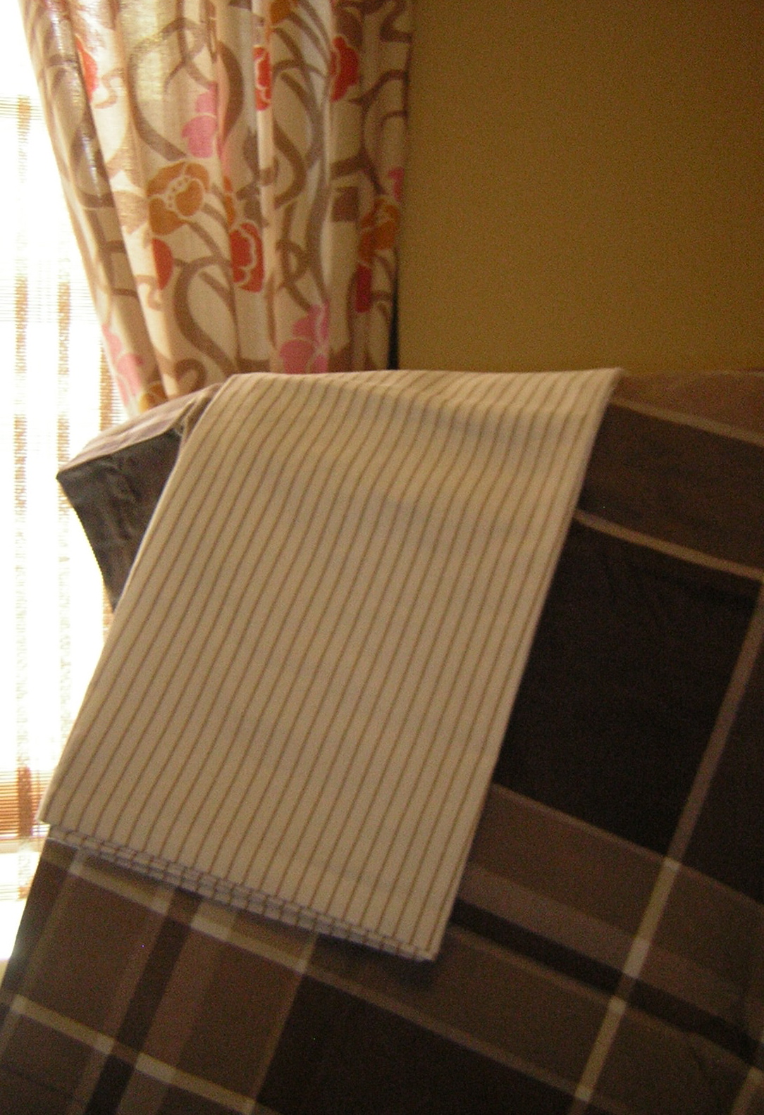
Initially, I rejected any notion of using a floral ... then I saw this interesting Art Nouveau-like pattern on drapes in Urban Outfitters. The brown, pecan, ivory and white work well together, and since the room's window and door trim is chocolate brown (Ralph Lauren's Desert Boot), the pink, orange and gold in the drapes keep the room from experiencing a brown-out.

Because each pattern is a different scale — thin pinstripes, medium floral, and larger plaid — they play well together, especially against the neutral walls (Ralph Lauren's Greenhouse Blonde).

Some accessories in the room are orange and hot pink to give these neutrals some punch, and there's even a leopard print lamp shade on the nightstand lamp to give the room an added dose of "chic."

Together, these layers of pattern and color create a rich retreat that's rather sweet and luscious.

Sunday, June 5, 2011

Scrapwood wallpaper by Dutch designer Piet Hein Eek


I've long been a fan of trompe l'oeil effects, and I'm gaga (no Lady involved) over this Scrapwood wallpaper by Dutch designer, Piet Hein Eek, featured here in the May 31 Interior Design magazine.

My one concern would be that if you used it on too many walls of a room or in a large room, you might feel like "climbing the walls" after awhile. I would use this for a cozy beach cottage, perhaps in a bathroom or even on the ceiling of a bedroom. It has many possibilities, and it's just great fun!

Find Scrapwood and many more inspiring wall coverings at www.wallpapercollective.com.

Saturday, June 4, 2011

June's Color Scheme: Glamazon Power

This color scheme is inspired by Elizabeth Taylor in the 1963 film, Cleopatra, in which the star wore countless costumes. Colorwise, the most intriguing was a sunset gold gown paired with a lavender shoulder veil — not a common color combination, but one that grabs your attention. I suspect the lavender was chosen to enhance Elizabeth's eyes, which were reportedly an unusual tint of purple.


Though panned by critics at the time, I think the film has a lot of merit, particularly for its visual appeal. In addition to the gold and lavender costume (I couldn't find a representative photo), Taylor's makeup was equally stunning. I was taken by the green-grey eyeshadow outlined in kohl black.

Cleopatra makeup


I envision this color scheme used in a small to medium-sized Mediterranean family room/kitchen with walls in yellow flash, baseboards in hazel, and window trim and ceiling in lavender secret. I'd place black and white photos on portions of the wall, framed in jet black with mats in yucca plant.

Colors:
Benjamin Moore Lavender Secret and Yellow Flash
Martha Stewart Living Precious Metals Hazel

Benjamin Moore Jet Black
Martha Stewart Living Yucca Plant

Sunday, May 22, 2011

Kitchen Window Update

I just upgraded a client's kitchen window (OK —spoil alert!—I'm the client) with a new natural Roman shade.
Previously, the window was dressed with a yellow and white striped balloon valance (unfortunately, I forgot to take the "Before" picture), which had faded to dirt.
I kept the shade neutral and simple because there's a lot going on in the room, as you can see by the blue and white plate collection on the wall.
I custom ordered the shade from Home Depot with a white privacy lining and a lefthand shade pull so I won't have to reach over to the right corner to open and close the shade.
This shade will help keep the room cooler in the summer months because it gets lots of sun and additional heat from a skylight.
I also repainted the window trim in super high-gloss white.