Friday, June 29, 2012

To Like & To Behold

This dining room/kitchen appeared in a recent issue of House Beautiful, and I find it nicely refreshing because:

A. There's no chinoiserie wallpaper with vines or birds. (Nothing against chinoiserie, but it's way overused in dining rooms).
B. There's no oriental rug — better yet, no rug at all. (Nothing against rugs in dining rooms, but really, do you want food to stick onto a rug or carpet?)


What I really like are the chairs. Apparently they were painted to look old, and expertly done. But I especially like the chair cushions featuring one fabric for the tops, and a completely different fabric for the bottoms. It's such a great detail.

I also adore this Vintage by Hemingway Design wallpaper collection I saw in a recent edition of Interior Design magazine, especially the 1930s-inspired Deco Diamond pattern. It's so chic and elegant.


I picture a movie star wearing a black fishnet-covered hat, sipping a sidecar and smoking a long-handled cigarette. Care to join me, Darling?

Sunday, June 10, 2012

Day of Coupage: The Game Changer

This work is kind of a companion piece to Ballerinas Having Flown (see previous post). I call it The Game Changer because the two men in the boat are confronted with potential obstacles, such as the erupting volcano to the right — plus their boat is perched precariously atop a bridge. Maybe they're jewel thieves (see sequins in boat) trying to escape with their loot?


I started with an 8"x10" canvas board and painted it titanium white (acrylic), with just a touch of potter's pink. I considered sponging the paint, but decided I like the way the deep colors of the wallpaper pop against the white.

Then I used my "Vista" vintage wallpaper sample, cut out the different pieces and laid them out on a white piece of paper. The difficult part was layering the pieces onto the canvas board to exactly match my original layout. (I photographed my layout and printed it out to recreate the pieces on the canvas). I applied the pieces using acrylic gloss medium, then added the blue sequins to finish it.

I used one of my fancy stick-on labels from Florence, and placed it on the back of the piece.


Sunday, June 3, 2012

Day of Coupage: Ballerinas Having Flown

This is another project I finished from my decoupage class, which I call "Ballerinas Having Flown."

My instructor, the excellent Jenn Sherr, took this photo of the work in progress.

Pretty Ballerinas decoupage

I started with an 8x10" canvas board and sponged it with acrylic paints in manganese blue, unbleached titanium, tint white, potter's pink, quinacridone carmine (burgundy), and iridescent bronze. I don't quite have the sponging technique down, but I took a small piece of sponge, dipped it in water just enough to dampen it, then I blotted it with just a little bit of paint. Then I took a piece of dry sponge and blotted and blended the paints together.

The ballerinas, flowers, leaves and ribbon are all from the same sheet of vintage wallpaper, The Ballet.

As I was cutting and placing the wallpaper pieces, I decided it was just too pretty, and needed a little edge, so I added the "disembodied" ballerina in the upper right. To finish with a little bling, I placed shiny blue sequins in strategic places, and voila!

Ballerinas Having Flown

The sequins happened to come on a wired sprig with a gift from my friend Patty D., and I think they add just the right touch, like little exclamation points (and maybe a little naughty whimsy — oh behave!).

On the back, I used acrylic gloss medium to attach a label (it's actually a beautiful sticker label I bought in Florence years ago).

Back label


Since the piece is a standard size, I decided to frame it, and now it's hanging in my bathroom — which happens to be blue and pink! Applause, bow, pirouette, curtain.

Ballerinas Having Flown, with chocolate metal frame


Monday, May 28, 2012

Day of Coupage: Pimp My Sneaker Ride

I just finished taking a fun, 6-week decoupage class at Cambridge Center for Adult Education, and completed a few projects. The most involved project was my pair of Nautica sneakers purchased at Filene's Basement back in the day.

Sneakers Bourgeois
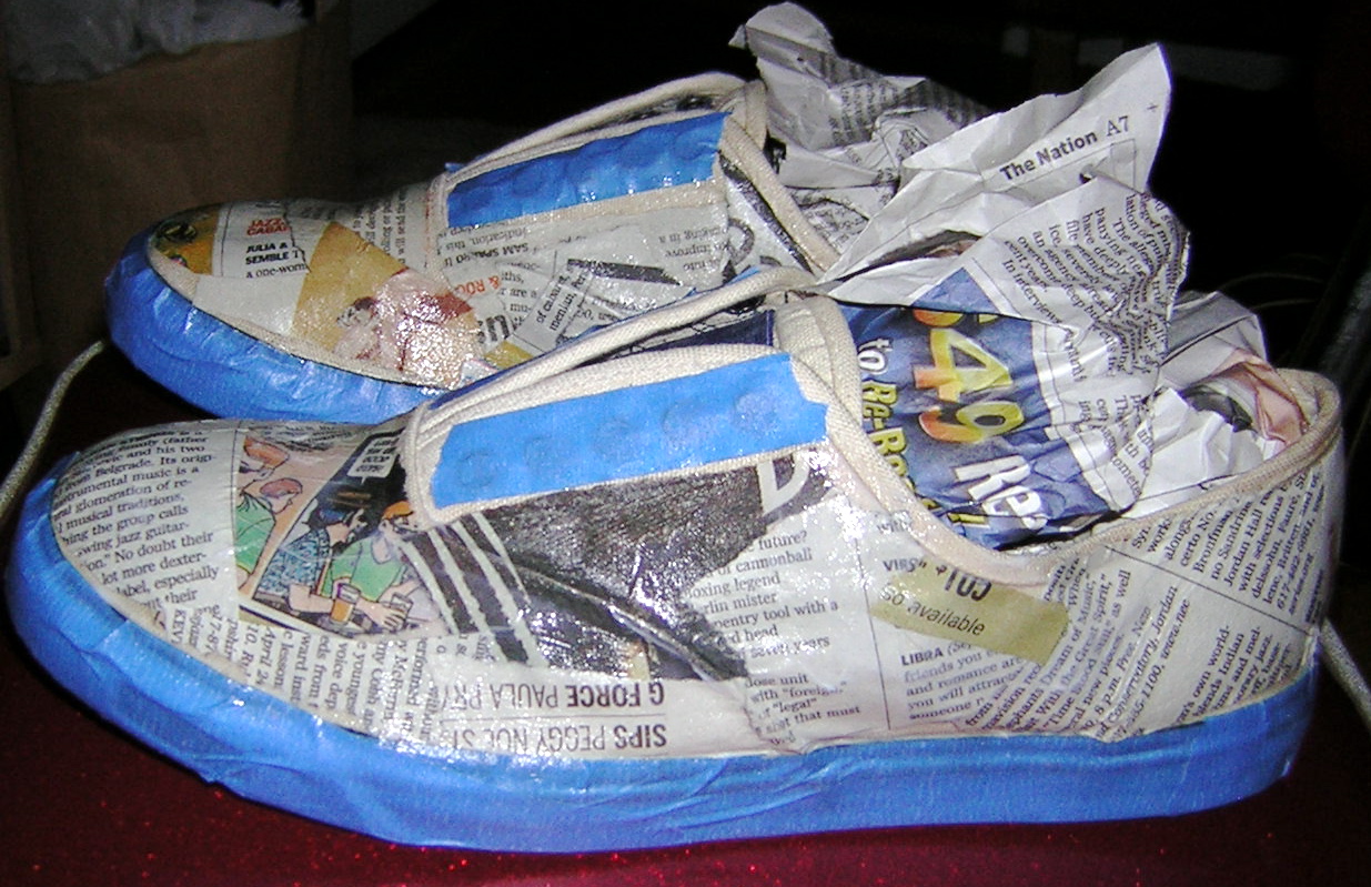
The first step was covering the bottom rubber sides and lace holes with blue painter's tape, then stuffing the insides of the sneakers to maintain their shape.

Then, I ripped newspaper into small random-shaped pieces, and using acrylic gloss medium, I glued two layers of the newspaper onto the sneaker, smoothing it over with my fingertips.

Sneakers Well Read

After applying the newspaper, I sprayed the sneakers with Krylon Crystal Clear acrylic coating. I did this outside so I wouldn't choke on the fumes.
Sneakers Take A Shine

Next, I ripped white copier paper into small pieces and applied two layers in the same way I applied the newspaper.
Sneakers White-washed

After spraying this layer twice with the Krylon coating (I allowed at least a day and a half to two days between sprays), I applied my first layer of the design — the Earth layer. The grass layer consists of images I took out of interior design magazines. The flower layer is taken from a birthday greeting card my aunt gave me years ago. I xeroxed the back and front of the card and cut out the flowers individually.

Sneakers Aglaze with Earth layer

My design theme is Earth and Sky, and for the Sky I xeroxed photos I took of my Christmas tree a few years ago, including vintage star lights and ornaments. The black and white moon faces on the toes are xeroxed from a great postcard I bought at a card shop in Manchester, VT years ago. The black stars are from a photo I took of the star mirrors on my Hollywood wall.

Sneakers Etoile Magnifique!

After applying the Sky layer, I sprayed the sneakers twice with Krylon. For the finishing touches, I used acrylic paints — cadmium yellow medium and manganese blue — to fill in any gaps in the design.  Then I removed the painter's tape and painted the tops around the lace holes with cadmium yellow. And, serendipitously, I found electric blue shoe laces as I was browsing in J.Crew, and they worked perfectly with my blue and yellow color scheme.

Voila! Sneakers Magnifique! C'est si bon?

Sneakers Pimped Out


Friday, March 23, 2012

New Orleans: Carnival of Color

My first visit to New Orleans was inspirational in many ways, especially for its fantastic color combinations. NOLA is a color-enthusiast's dream — I don't think I saw one neutral interior or exterior, except at my hotel.

Fleur-de-Lis wallpaper, Royal Orleans Hotel

Though the typical color schemes on souvenirs and such are green with purple, and black with gold, the architecture features vibrant color combinations of every imaginable type, especially throughout the French Quarter. Unlike, say, Miami or Bermuda, which feature exclusively pastels, New Orleans boasts both dark and light combinations, such as turquoise with black:


Rose with mint and celery green:


Coral with forest green and white:


Yellow with purple:


Dusty blue with deep rose:


And dusty red with green and white:


I also spotted a deep marine blue with deep eggplant but missed the photo op. This is an approximation of the colors, both deeply saturated:


Color in NOLA extends to its abundant ironwork, here in frosted purple and mint julep green:


And even to its local transportation:

Pastel Schwinn

Saturday, February 11, 2012

It's a Marshmallow World ...

I saw this fantastically cool retro sofa in my most recent Interior Design magazine and have to share.


It's the Draper sofa (named after Don of Mad Men, perhaps?) by Armen Living. It's made of solid pine, and is covered in a poly/cotton chenille fabric.

In addition to the sleek silhouette and fab oblong back cushions, what totally makes it is the contrasting piping. It gives added definition to its sexy shape. I could also see this covered in white terrycloth with lime piping. Or maybe orange leather with cherry piping — delicious, delicious!

It also reminds me of George Nelson's iconic Marshmallow sofa, which I've always had a soft spot for — even more delicious, delicious!

Saturday, December 17, 2011

Vintage Wonderland Part III

Here's my 2011 Christmas tree, imported from South Windsor, CT. Special thanks to my Aunt Lucille for helping me choose it.


The large papier mâché angel hanging from the window molding is from Filene's Basement back when they used to have their annual Christmas in August Sale (so sad to see the Basement go this year).


This year's tree color scheme is blue and gold. The lights are all vintage C-6 sets with some bubble lights, Reliance Krystal Stars (1930s, made in Rhode Island), and plastic stars from Japan (1940s). 
There are also metal reflectors on some of the regular cone-shaped bulbs, also in blue and gold.

Most of the ornaments are vintage with some new ones mixed in. 

The real miracle is that I managed to stuff this 7-foot tree into my Honda Civic (it's not a hatchback or SUV!) and drive it from CT to Boston without completely destroying it.


The plastic angel light on top was purchased at the Brimfield Antiques Show a few years ago. 
Her halo is broken but she's otherwise in very good shape. I'm guessing she dates from the 1950s, but I'm not sure.

HAPPY HOLIDAYS TO ALL!