Sunday, June 19, 2011

June's Pattern Mix: Brown-out Fix


A nearby "client" asked me to freshen up his master bedroom with new window treatments and bedding. I was pleased to oblige.

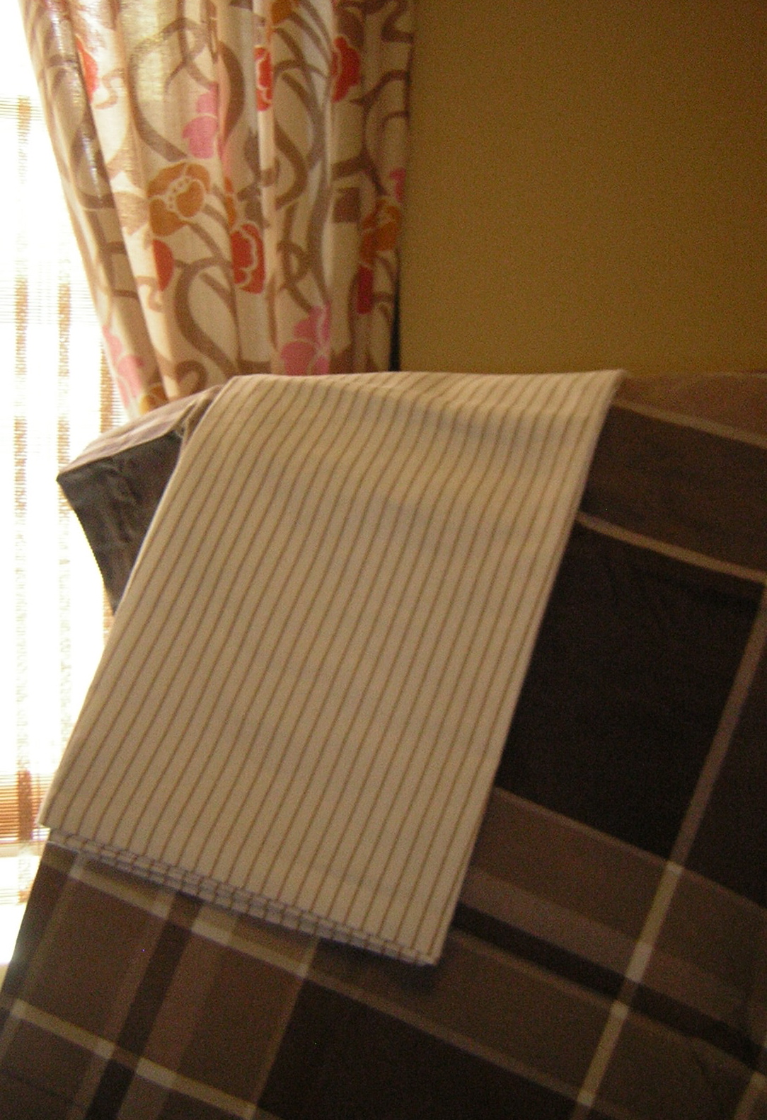
Initially, I rejected any notion of using a floral ... then I saw this interesting Art Nouveau-like pattern on drapes in Urban Outfitters. The brown, pecan, ivory and white work well together, and since the room's window and door trim is chocolate brown (Ralph Lauren's Desert Boot), the pink, orange and gold in the drapes keep the room from experiencing a brown-out.

Because each pattern is a different scale — thin pinstripes, medium floral, and larger plaid — they play well together, especially against the neutral walls (Ralph Lauren's Greenhouse Blonde).

Some accessories in the room are orange and hot pink to give these neutrals some punch, and there's even a leopard print lamp shade on the nightstand lamp to give the room an added dose of "chic."

Together, these layers of pattern and color create a rich retreat that's rather sweet and luscious.

Sunday, June 5, 2011

Scrapwood wallpaper by Dutch designer Piet Hein Eek


I've long been a fan of trompe l'oeil effects, and I'm gaga (no Lady involved) over this Scrapwood wallpaper by Dutch designer, Piet Hein Eek, featured here in the May 31 Interior Design magazine.

My one concern would be that if you used it on too many walls of a room or in a large room, you might feel like "climbing the walls" after awhile. I would use this for a cozy beach cottage, perhaps in a bathroom or even on the ceiling of a bedroom. It has many possibilities, and it's just great fun!

Find Scrapwood and many more inspiring wall coverings at www.wallpapercollective.com.

Saturday, June 4, 2011

June's Color Scheme: Glamazon Power

This color scheme is inspired by Elizabeth Taylor in the 1963 film, Cleopatra, in which the star wore countless costumes. Colorwise, the most intriguing was a sunset gold gown paired with a lavender shoulder veil — not a common color combination, but one that grabs your attention. I suspect the lavender was chosen to enhance Elizabeth's eyes, which were reportedly an unusual tint of purple.


Though panned by critics at the time, I think the film has a lot of merit, particularly for its visual appeal. In addition to the gold and lavender costume (I couldn't find a representative photo), Taylor's makeup was equally stunning. I was taken by the green-grey eyeshadow outlined in kohl black.

Cleopatra makeup


I envision this color scheme used in a small to medium-sized Mediterranean family room/kitchen with walls in yellow flash, baseboards in hazel, and window trim and ceiling in lavender secret. I'd place black and white photos on portions of the wall, framed in jet black with mats in yucca plant.

Colors:
Benjamin Moore Lavender Secret and Yellow Flash
Martha Stewart Living Precious Metals Hazel

Benjamin Moore Jet Black
Martha Stewart Living Yucca Plant